Color Trends - Perception
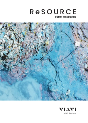
Each year, VIAVI color professionals create a palette of “colors to watch” based on extensive trend research.

Perception
PERCEPTION IS MORE THAN MEETS THE EYE.
Messy, chaotic information from our eyes is transformed into data that the brain can make sense of through a process involving dozens of alterations, assumptions, and omissions.
That means our perceptions of objects out in the world are influenced by many more factors than simply what we are seeing.
The less you pay attention, the more things begin to coalesce into a hazy blur. You may miss the whole picture.
We expand our powers of PERCEPTION when we take time to seek out and observe mindfully the implicit and the explicit in our environment, our communication, and our cognition. We hear the music, feel the mood, experience the color. In this convergence, our view of the universe expands in complexity and wonder.
This is the year to throw open the curtains of your PERCEPTION. You are empowered to begin to differentiate the information coming at you.
We invite you to explore Perception.

Explicit
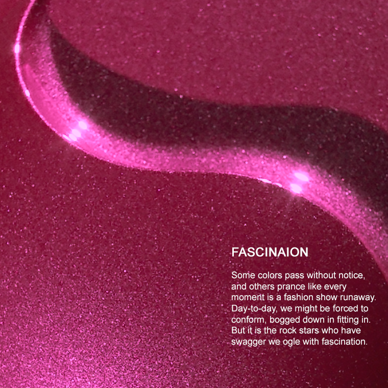
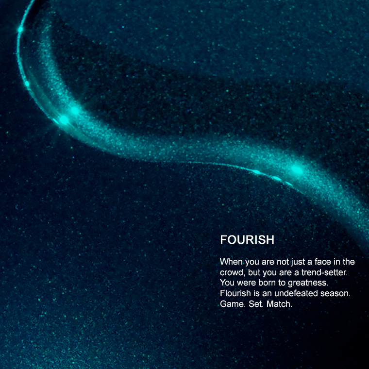
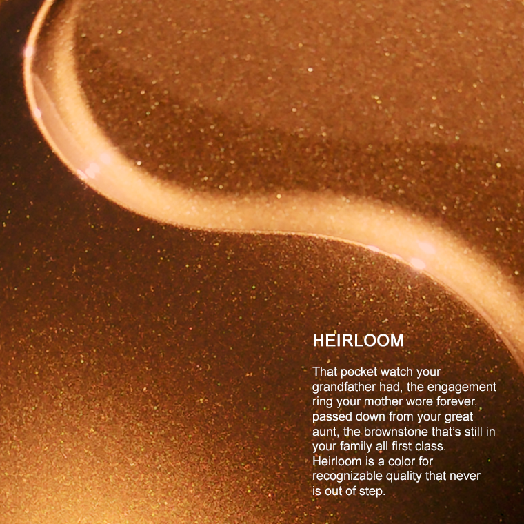
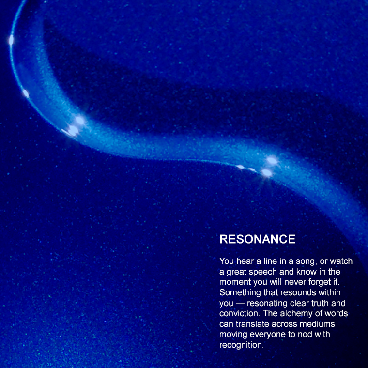
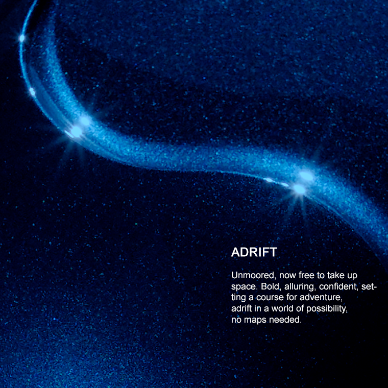
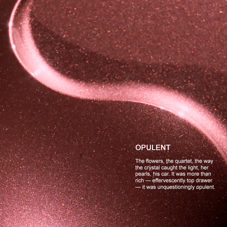
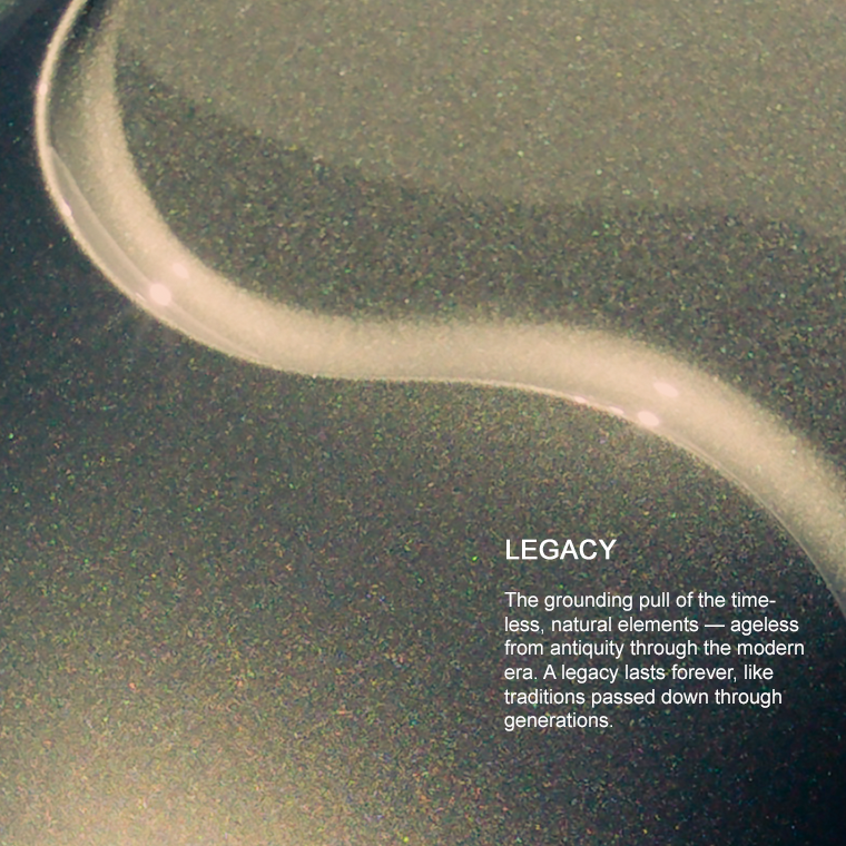
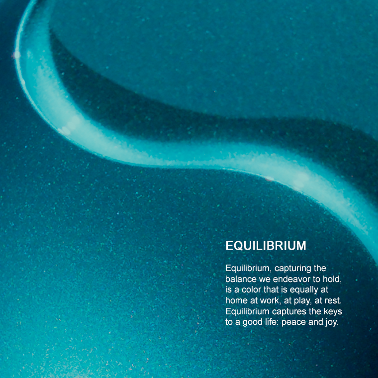
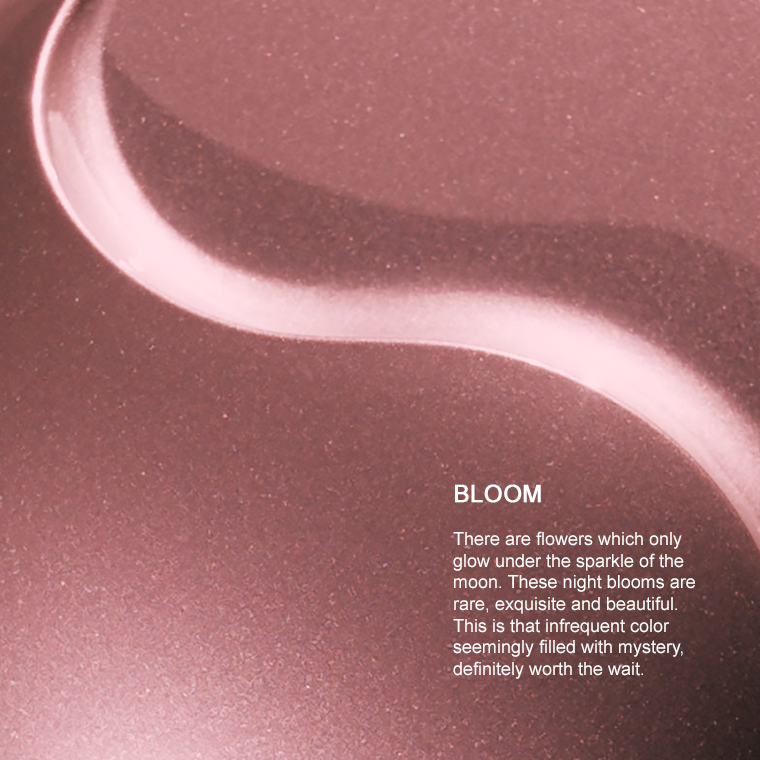
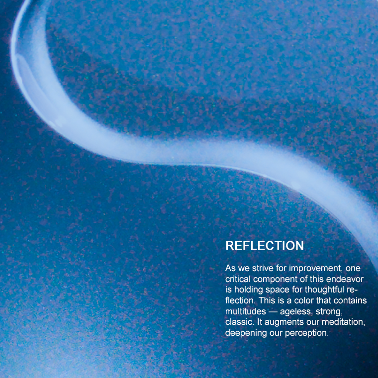
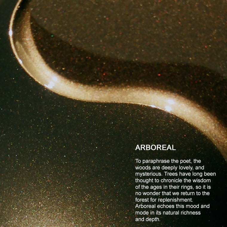
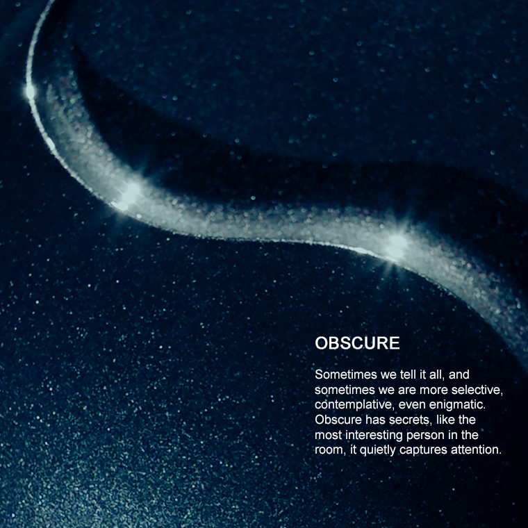
From a color perspective, explicit color can refer to the apparent gloss, chroma, hue shift — features that jump out immediately.
Implicit
Implicit features of a color refer to its subtle aspects – components requiring a second pass–revisiting its tactile texture, or its sparkle area, taking time to reconsider the depth of the hue due to saturation, or even confronting the feelings it invokes.

Learn more about ChromaFlair®

Learn more about SpectraFlair®


Color Collections



Let Us Help
We’re here to help you get ahead.